 Whether you are a freelancer, consultant, coach or any other kind of service provider, you’ll never close the sale on your website’s home page.
The purpose of your home page is not to make the sale. Its purpose is to hook and engage your first-time visitor.
You need to write and design a home page that makes your visitor feel…
“Yes, I’m in the right place, and the 20 words I have read so far make me feel confident enough to check out some other pages on this site.”
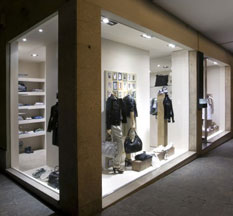
If you can’t quite see that in your mind’s eye, let’s look at the shop window analogy.
As you are hurrying down the sidewalk, on the way somewhere else, you find yourself in front of the shop window of a clothing store.
Something about the display hooks you and makes you stop, even if you are in a hurry to be elsewhere.
Not every item in the store is there in the display. The purpose of the display is not to display everything they sell, it is to make you feel…
“Wow, this is interesting, and by the look of it they carry some clothing that I will absolutely love. I’m going to change my plan to go somewhere else, and instead I’m going to step into this store.”
It’s the same deal with your home page.
People are rushing by, one click away from moving on to their Facebook page, or a Google search page, or their Twitter page, or their email inbox.
As they take a quick look at your homepage, they are not going to put aside the time to read your long sales pitch or an essay on how wonderful you are. Instead, they are going to glance at your page and make a quick decision as to whether or not it’s worth staying on your site for more than 10 seconds.
That’s it. That’s all your homepage should be designed to do. Don’t try to put your entire sales pitch on the page. Don’t try to tell the whole store. That’s not what the home page is for. Just tell them enough to make them feel compelled to get off the “sidewalk” and click through to an interior page of the site.
If this doesn’t make much sense to you, consider your own behavior when you come across a website for the first time. What do you do? Do you settle back with a coffee and read every word on the homepage? I bet you don’t. I bet you take a quick look around and then decide on whether to leave or stay.
And that’s what it’s all about.
Your home page should achieve only two things.
1. Be interesting and relevant enough to make first-time visitors want to stick around for more than a few seconds.
2. Offer clear links through to the interior pages your visitor will find the most relevant and interesting.
What are those links? They are the doorways into the interior of your site.
The shop window and its display is your homepage. The doors into the store are your principal links that take people to the pages on your site that carry the value they are looking for.
Finally – as with any attention-grabbing shop window display – make your home page look good. A shoddy display window never catches people’s attention, or makes the right impression.


If you found this post helpful, sign up for my e-newsletter and get a free copy of my 35-page guide…
Writing For The Web #1 — 7 Challenges every Writer and Copywriter faces when writing for the Web.
Sign up and I’ll send you the link for the download, and then you’ll receive my most recent post as part of my e-newsletter every Tuesday morning.
(Your email address will be used only for the purpose of sending you this newsletter, and you’ll be free to unsubscribe at any time.)